The Faversham
Identity / Print Design / Web Design
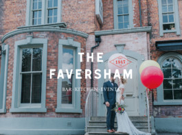
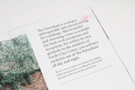
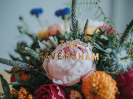
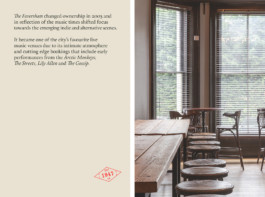
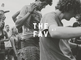
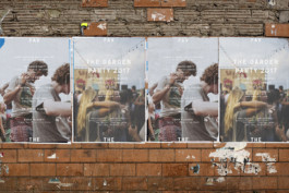
A true institution of the city of Leeds, The Faversham – or The Fav, as it is affectionately known by locals – claims a long and illustrious history that is indelibly tied to the music scene of the city. To those who are familiar with it, The Fav conjures up memories of heady student days gone by (due to its proximity to the University) and legendary gig nights, while more recently, the venue has embraced a new, multi-faceted outlook. The Faversham approached us for a rebrand, with the visual identity aiming to strike a delicate balance; one that would not alienate the largely student population that eat, drink and socialise there week in, week out, but also embrace a new focus in appealing to couples looking for a unique place in which to tie the knot.
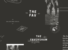
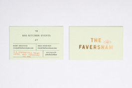
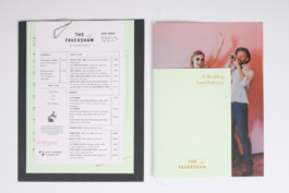
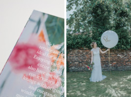
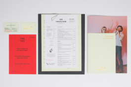
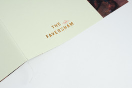
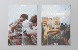
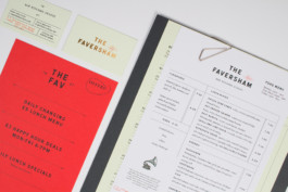
We wanted to reflect the notion that The Faversham represents many things to many people, so by utilising the duality of the full brand name and it's abbreviation and then varying the ways in which these are presented has enabled us to achieve a flexible system that can be adapted to make appropriate for different situations. The way the brand is applied in each of these instances also further distinguishes the different ends of the spectrum within the identity. For example, when catering for weddings and large events, it's given a full title of The Faversham, and its application includes luxe finishes such as gold foiling, but when students are grabbing a pre-gig burger, it can also be referred to as The Fav, and simpler, rudimentary techniques such as stamps and informal handwriting/scribbles are more prominent.
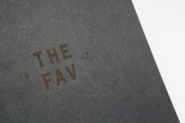
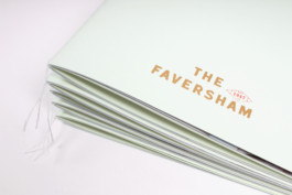
The typography that makes up the core logotypes is bold and confident but contains subtle quirks and imperfections that hint at the unconventional nature of the venue. The numerous brand marques also feature different takes on the 'Established 1947' date which thoroughly reinforces the heritage of the building while extra graphic assets such as the gramophone illustration give an instant acknowledgement of its ties to the music scene.
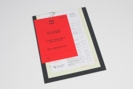
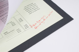
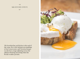
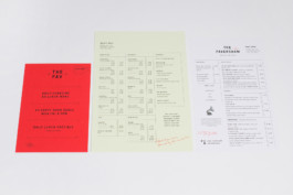
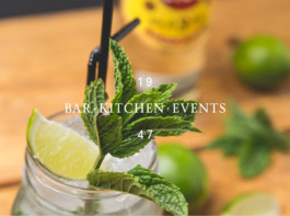
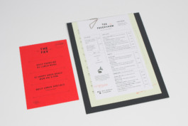
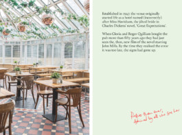
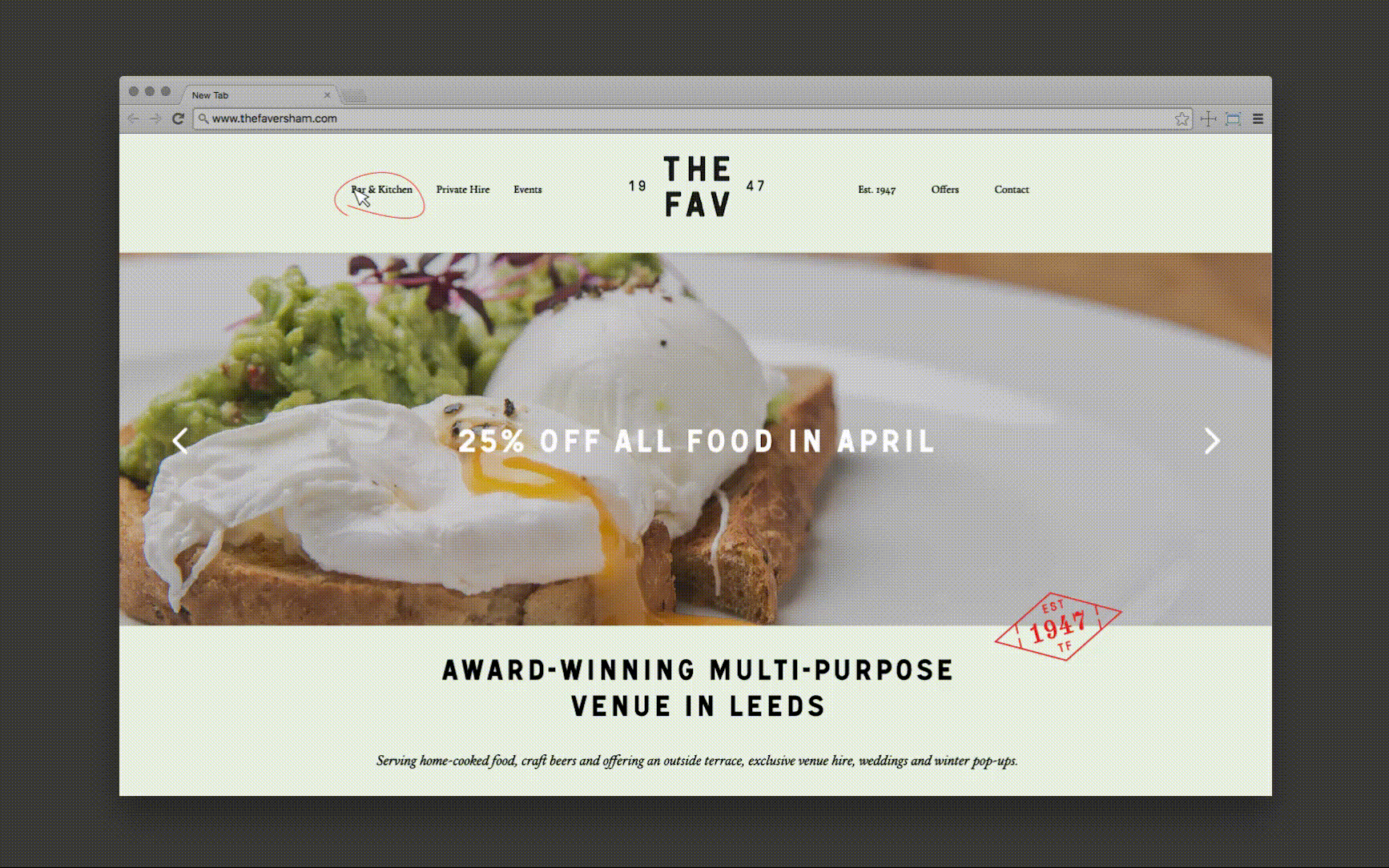
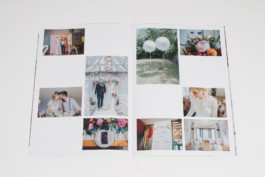
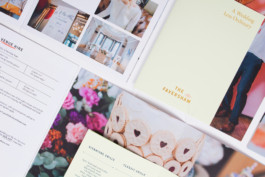
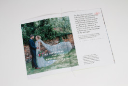
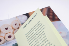
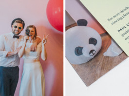
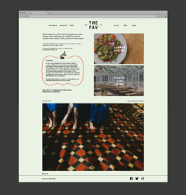
The brand identity has been applied across a set of menus which feature contrasting coloured paper stocks and page sizes which are clipped onto a laser-etched heavyweight board. Some of these papers and formats then crossover into the wedding catalogue which has a short cover and inner booklet which are singer-sewn to the large format, image-heavy sheets. Finally a fully revamped website has been designed which seamlessly carries through the new aesthetic, providing a simple but pleasing online experience enabling customers to learn about the multitude of events ongoing at The Faversham.
Credits
Website build by Ow Do
Wedding Photography by Sarah Maria Photography